
Sunday, February 22, 2009
Saturday, November 15, 2008
Project #3 POSTER DESIGN

COMMUNICATING THE SUSTAINABLE IDEAL
A poster is any piece of printed paper designed to be attached to a wall or vertical surface. Typically posters include both textual and graphic elements, although a poster may be either wholly graphical or wholly textual. Posters are designed to be both eye-catching and convey information. Posters may be used for many purposes, and they are a frequent tool of advertisers (particularly of events, musicians and films), propagandists, protestors and other groups trying to communicate a message. Posters are also used for reproductions of artwork, particularly famous works. Another type of poster are educational posters, which may be about a particular subject for educational purposes. Related to these are academic or conference are generally low-cost compared to original artwork. Many people also collect posters, and some famous posters have themselves become quite valuable, collectors and vintage posters are usually framed and matted. Posters may be any size.
Your assignment is to design a poster for a hypothetical not-for-profit organization advocating sustainability. Therefore, you will need to invent both a name and logo design for your organization, and include them within the poster design.
Visual Communication Objective:
The objective of the designs is to elicit discussion regarding the critical nature of the sustainable movement in order to inspire people to embrace the ideal.
Design Specifications—“The Project Criteria!”
The Designs must:
Language Options: English, French, Spanish, German
Design must be on an 11x17” format, or larger.
Must include color
The poster design may include both hand-rendered illustration and digital imagery.
Classical Design Principles
Primary Principles: Unity, Variety, Hierarchy, Proportion
Support Principles: Scale, Balance, Rhythm, Repetition, Proximity
Elements of Art & Design
Shape, Space, Point, Line, Size, Color, Texture, Typography
What’s required for each design:
First Round Thumbnails: 10 (ten)
Second Round Thumbnails: 10 (ten)
Rough 11x8.5”
Be mounted on black foam board with a 3-inch boarder.
Second round thumbnails, rough and final comp must be scanned and uploaded to your own blog.
Comprehensive must be placed on blog!
Graded on
How well you address the needs of the project!
Completing the evaluation form, and including all of that you have written, directly below the comprehensive on your blog!
Here's my Logo:
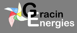
And this is my poster:


Tuesday, September 30, 2008
Project #2- Stamp Design
Hall Groat II, Art 125 Stamp DesignCommemorating Historic Preservation ofArchitecture and Sustainability You are to create one unique stamp design that commemorates a notable local or regional historic landmark building. Your stamp design must be based on a design style from the past. The objective is to present to the American public the concepts of historic preservation and sustainability, and ultimately inspire them to perhaps embrace these ideals.
Design Styles from the Past!
Art Nouveau (Late 19th Century to Early 20th Century)
Bauhaus (1920’s)
Constructivism (Russian 1913-1920's)
Art Deco (1920-1930)
International Typographic Style (Swiss School of Design 1950-1970)
Modernism / Modern Movement/New York School (United States 1940’s – 1960’s)
Creative Process
1. Collect (20) twenty or more examples of stamp designs that are visually engaging. Create a digital archive of these saved on your flash disk. Place examples on your blog!
2. Choose your (3) three favorite designs. Make a descriptive list (in bullet form) referencing the specific “informational elements” and “design elements” that are contained within the three collected stamps (lists are below).Place analysis on your blog!
3. Collect five (5) graphic design examples of each of the historic design movements outlined above.
4. Choose (1) example from each style and make a descriptive list (in bullet form) referencing the specific design characteristics that make each style unique.Place analysis on your blog!
5. Photograph a local landmark building to base your design on.
6. Create an Illustration of Local Historic Landmark. The illustration can either be hand rendered in a traditional color medium of your choice or a digital manipulated rendition.
7. First Round Thumbnail Sketches. Work on 20 thumbnail sketches that investigate design concepts for your stamp design.
8. Chose strongest thumbnail concept and complete 20 more second round thumbnail sketches that present variations on a single one.
9. Create a single rough based on the strongest conceptThe rough needs to be at least five inches in height and width. The final dimensions will depend on if you have chosen to design on a square or rectangular format.
10. Digital Scan of Illustration in Photoshop
11. Photoshop digital manipulation and enhancement
12. Comprehensive Layout in Photoshop13. Mounting Two Parts: Original Illustration and Stamp Design
14. The entire creative process must be included on your blog, including all thumbnails, along with final rough and comprehensive.
Informational Elements
§ Central Image – Your illustration
§ Denomination (Example: 37 cents, $1)
§ Country of Origin (Example: USA)
§ Name of Landmark§ Date Landmark was built
§ Date (year) Stamp was Designed (The year “2005” typeset in 7 or 8 points)
§ Significance (A short phrase relating to the significance of the landmark is often noted.)
Design Elements Ask yourself “How were these concepts applied?”
§ Shape of Postage Stamp / Proportion of Stamp / Horizontal or vertical
§ Four Color / Spot Color/ Colors Used Develop a color scheme. What colors conceptually relate to the landmark and design style you work with
§ Type of Central Image / The Illustration§ Line Detailing / Borders
§ Interpretive Dimension of Type /Type supports the aesthetic of the artwork/theme
§ Typographical Layout Vertical Type, Horizontal Type, Type on a curve
§ Hierarchical arrangement of elements (Most to least important—Focal Point)
§ Position (proximity) of all informational elements / Symmetrical/Asymmetrical
§ Compositional Devices / Use of Grid§ Type of Balance Symmetrical or Asymmetrical§ Illusion of Space / Depth§ Relationship of Positive and Negative Space
Physical DimensionsIllustration: 8.5” by 11” or 8.5 by 8.5”Final Comp: One (1) printed at 5 x 8” and One (1) printed the actual size of a stamp (which will vary) (For example, a rectangular stamp may measure 1.5” x 1” and a square 7/8” x 7/8”)Spend some time measuring some actual stamps and choose a dimension that is conducive to your design.
Presentation Single Illustration mounted on one section of foam core (unless it was painted on canvas)Comp must also be mounted on one section of foam core.
Production Information & Design Description This information needs to be presented on a separate section of foam core. The dimensions must be 2 inches tall by 4 inches wide. The type size must be 9 points.
· Your name / Name of Design
· Name of Software Used / Date
· Paragraph specifically describing how your stamp designrelates to the chosen style or styles of architecture, or graphic design movement.
Graphic Concepts To Consider For Dynamic Designs
· Contrasting Scale of Images
· Contrasting Scale of Type
· Typographical Variation:Upper Case / Lower CaseWeight of Text / Bold / ItalicVaried Letter Spacing
· Considering the amount of Negative Space left in design
· Clustering of Text Into Units Based On Content
· Nesting Text
· Overlapping of Images and Text To Create Unity
· Typographical Harmony – Family of Font, Style of Font
· Altering Opacity To Create Sense of Depth and Emphasis In Design
· Color Harmony – Relationship of Text Color with Image Color


Here's a picture of Johnson City High School:


Design Styles from the Past!
Art Nouveau (Late 19th Century to Early 20th Century)
Bauhaus (1920’s)
Constructivism (Russian 1913-1920's)
Art Deco (1920-1930)
International Typographic Style (Swiss School of Design 1950-1970)
Modernism / Modern Movement/New York School (United States 1940’s – 1960’s)
Creative Process
1. Collect (20) twenty or more examples of stamp designs that are visually engaging. Create a digital archive of these saved on your flash disk. Place examples on your blog!
2. Choose your (3) three favorite designs. Make a descriptive list (in bullet form) referencing the specific “informational elements” and “design elements” that are contained within the three collected stamps (lists are below).Place analysis on your blog!
3. Collect five (5) graphic design examples of each of the historic design movements outlined above.
4. Choose (1) example from each style and make a descriptive list (in bullet form) referencing the specific design characteristics that make each style unique.Place analysis on your blog!
5. Photograph a local landmark building to base your design on.
6. Create an Illustration of Local Historic Landmark. The illustration can either be hand rendered in a traditional color medium of your choice or a digital manipulated rendition.
7. First Round Thumbnail Sketches. Work on 20 thumbnail sketches that investigate design concepts for your stamp design.
8. Chose strongest thumbnail concept and complete 20 more second round thumbnail sketches that present variations on a single one.
9. Create a single rough based on the strongest conceptThe rough needs to be at least five inches in height and width. The final dimensions will depend on if you have chosen to design on a square or rectangular format.
10. Digital Scan of Illustration in Photoshop
11. Photoshop digital manipulation and enhancement
12. Comprehensive Layout in Photoshop13. Mounting Two Parts: Original Illustration and Stamp Design
14. The entire creative process must be included on your blog, including all thumbnails, along with final rough and comprehensive.
Informational Elements
§ Central Image – Your illustration
§ Denomination (Example: 37 cents, $1)
§ Country of Origin (Example: USA)
§ Name of Landmark§ Date Landmark was built
§ Date (year) Stamp was Designed (The year “2005” typeset in 7 or 8 points)
§ Significance (A short phrase relating to the significance of the landmark is often noted.)
Design Elements Ask yourself “How were these concepts applied?”
§ Shape of Postage Stamp / Proportion of Stamp / Horizontal or vertical
§ Four Color / Spot Color/ Colors Used Develop a color scheme. What colors conceptually relate to the landmark and design style you work with
§ Type of Central Image / The Illustration§ Line Detailing / Borders
§ Interpretive Dimension of Type /Type supports the aesthetic of the artwork/theme
§ Typographical Layout Vertical Type, Horizontal Type, Type on a curve
§ Hierarchical arrangement of elements (Most to least important—Focal Point)
§ Position (proximity) of all informational elements / Symmetrical/Asymmetrical
§ Compositional Devices / Use of Grid§ Type of Balance Symmetrical or Asymmetrical§ Illusion of Space / Depth§ Relationship of Positive and Negative Space
Physical DimensionsIllustration: 8.5” by 11” or 8.5 by 8.5”Final Comp: One (1) printed at 5 x 8” and One (1) printed the actual size of a stamp (which will vary) (For example, a rectangular stamp may measure 1.5” x 1” and a square 7/8” x 7/8”)Spend some time measuring some actual stamps and choose a dimension that is conducive to your design.
Presentation Single Illustration mounted on one section of foam core (unless it was painted on canvas)Comp must also be mounted on one section of foam core.
Production Information & Design Description This information needs to be presented on a separate section of foam core. The dimensions must be 2 inches tall by 4 inches wide. The type size must be 9 points.
· Your name / Name of Design
· Name of Software Used / Date
· Paragraph specifically describing how your stamp designrelates to the chosen style or styles of architecture, or graphic design movement.
Graphic Concepts To Consider For Dynamic Designs
· Contrasting Scale of Images
· Contrasting Scale of Type
· Typographical Variation:Upper Case / Lower CaseWeight of Text / Bold / ItalicVaried Letter Spacing
· Considering the amount of Negative Space left in design
· Clustering of Text Into Units Based On Content
· Nesting Text
· Overlapping of Images and Text To Create Unity
· Typographical Harmony – Family of Font, Style of Font
· Altering Opacity To Create Sense of Depth and Emphasis In Design
· Color Harmony – Relationship of Text Color with Image Color
1. Collect (20) twenty or more examples of stamp designs that are visually engaging.
Well here's more then 20 but it shows how each type of stamp can have different varieties.
Well here's more then 20 but it shows how each type of stamp can have different varieties.


Choose your (3) three favorite designs. Make a descriptive list (in bullet form) referencing the specific “informational elements” and “design elements” that are contained within the three collected stamps.

·The central image of this stamp is the blue snowflake in the middle
·The Denomination is $.39
·The country of origin is USA
·Year of stamp is 2006
·The shape of the stamp is a rectangle.
·The main color is blue, with some read and green mixed in.
·The snowflake is positioned directly in the center.
·The picture is symmtrical, but the stamp as a whole is asymmtrical because the 39 isn't balanced with anything.
·I like this stamp because the use of blues give it a 3D look. I think it would make a great stamp for a christmas card.
·I like this stamp because the use of blues give it a 3D look. I think it would make a great stamp for a christmas card.

·The central image is a building in poland.
·The denomination is 50 zloty, polish currency
·The country of origin is Poland
·No date of when the stamp was made but it was some time around WWII.
·Generalgouvernement was a german run government in part of Poland around the WWII.
·The shape of the stamps is a rectangle.
·The color is different shades of blue.
·The text of the stamp is horizontal.
·The Hierarchy is the building is the most important, then the cost, then the bird symbol on the top, then the Generalgouvernement at the bottom.
·The postion of the building is to the left. With the bird and cost on the right. The Generalgouvernement is at the bottom.
·The stamp is Symmetrical. The bird and the cost on the left balance the buiding on the left.
·The shades of blue give the building a sence of depth.
Examples of Art Nouveau:

Examples of Bauhaus:

Examples of Constructivism:

Examples of Art Deco:

Examples of International Typographic Style:
Here's a picture of Johnson City High School:


And here's my Illustration :
And this is my final piece:


PROJECT #1 - TYPOGRAPHICAL DESIGN - COMMUNICATING THE SUSTAINABLE IDEAL
Art 125—Introduction to Computer ImageryProfessor GroatCOMMUNICATING THE SUSTAINABLE IDEAL-------------------------------------------------------------------------------------------------------------------------Design is the method of putting form and content together. Design, just as art, has multipledefinitions; there is no single definition. Design can be art. Design can be aesthetics. Designis so simple, that's why it is so complicated. –Paul Rand, American Designer 1914-1996------------------------------------------------------------------------------------------------------Your assignment is to research sustainability on an international scale. After you have completed your research, design two typographical artworks, involving only type, which are intended to elicit discussion relating to the critical nature of this current issue. One design must be based on bilateral symmetry and the other must be asymmetrical in form. The artworks will be circulated via world-wide-web for millions of people to respond to. There may be some of you who believe that this movement is less critical than others and perceive it as merely sociopolitical propaganda, and perhaps would like to express your perspective differently. You are the fine artist; therefore you are free to express your unique viewpoint! However, the “forms” of your designs must meet specific criteria that conform to what’s been deemed as successful visual communication.
Visual Communication Objective:The objective of the designs is to elicit (or provoke) global discussion regarding the critical nature of the sustainable movement, through using both the Internet and traditional print media. The designs should entice the viewer to consider both the social significances and unique relationships between the five concepts.
Design Specifications—“The Project Criteria!”:The Designs must:Be created within a square format – 8.5”x 8.5”Include five (5) words or unique concepts.Be based on a single, or two different themes, meaning, the symmetrical design can include the exact same words or concepts that the asymmetrical design contains.Be created using only grayscale.Implement all classical design principles.Be created using the “rule of thirds.”
Here are my Asymmetrical thumbnails:


And these are my Symmetrical thumbnails:


Sorry about the quailty had to take picture to get it on the computer. I'll try to replace it with a scan when i can get to a scanner.
And these are my Roughs. Same as above, I'll try to replace as soon as possible:


Here's my final Symmetrical piece:

And here's my Asymmetrical:

Well above you read about what the teacher wanted us to do. Now it's time for my thoughts on the project:
The whole idea of the project is to create a project that get's people thinking about sustainablity and the planet as a whole. I think the way things are going now that were gonna be in a lot of trouble down the line. But complaining about it won't really help matters any. We've gotta start coming up with solutions. And thats what my project is about.
Some of my solutions may seem stupid to others but you'd be surprised how effect they might actually be. The way i arranged them was in order of largest to smallest. That is the bigger things that you might not be able to do yourself or right away to the ones that you can do anytime you want. Wind power I think is the biggest one because how many of us can stick wind mills in our back yard? Not many but i'm sure if people worked together we'd find some good places to put some wind mills. Then there's hybrid cars. Also a very good idea. With these you can cut down the polution by quite a bit. But unforunately they cost a lot. I could even afford to get a car form 12 years ago without some help. Don't think I be able to afford a car that runs $20,000 if your lucky. There's also solar panels. Put a couple of them on your roof and on a sunny day you don't have to worry about much of an eletric bill. This ones a little easier to do but still a pain. First you've gotta get the panels. Then you've gotta figure out how to get them installed and that's probably the hardest part. Second to last is walking more. Cars are a very convient thing that help us travel. But come on do you really have to drive to the gas station or friends house that's only a block and a half away! Walking even just a little more is a little less polution that your putting into the air. My last solution is plant a tree. It doesn't get much easier then digging a whole in the ground and sticking a seed in there and covering it back up. And you don't even have to buy seeds anymore if you don't want to. There are places you can buy tree that have already been partial grown. But that's enough of my personal rant. Now it's time for some more techinal stuff.
As everyone know Symmetry is all about the balance. If one side isn't balanced with the other then it's not symmetrical. I tried to make my symmetrical piece as balanced as possible. I also decided to use some repetition with my piece. Whether it's 5 or 50 words long you know what's going to happen next. There's a definate rhthym to the piece, black background with white text then white background with black text. Then it starts over again. They hierarchy I used is form top to bottom, kinda like a book. And i decided to have the prorotion the same for all of them to keep with the repeating theme. As for keeping with the rule of third like the project said I suppose I didn't do that, but i still like the way the project turned out. I like that fact they my Symmetrical piece is open ended. If you want to ad more solutions to it you can all you have to do is put it on at the bottom or top.
Asymmetry is of coarse the opposite of symmetry, it's about being off balance. Which i accomplished in my piece. I decided to use scale to my advantage by decreasing the scale as you read down the page. Then in my final piece I used scale and variety in the gray scale to give the piece a fading effect. I used the same hierachy in the same as my Symmetrical piece. And I also gave my piece rhythm by giving a nice downward flow to the piece.
I think my project was successful because I was able to bring different element of design together to create pieces that get the view thinking. Who knows they might even decide to add a few solutions of their own. Anyways leave some posts about what you think about my project and what could make it better.
Subscribe to:
Posts (Atom)